Why isn’t Outlook.Com responsive?
I noticed a while ago that Outlook.com was supporting media queries on there full sized site but not on their mobile version. Yup, they got it the wrong way round. I tried a few tricks to try and get around this but to no avail so I decided to dig a little deeper.
First off I downloaded an app on my phone to view the source of the website but it was pretty hard to read on the small screen so I moved back to the desktop. Outlook.com use the m. method for their mobile site rather than responsive so I couldn’t just shrink the browser down to see what was happening I needed to simulate a mobile device. I did a quick search and downloaded the User agent switecher chrome plug in. That combined with firebug gave me a good view of the source code to start debugging.
How Outlook.com handels your code
To makesure none of your CSS effects the Outlook.com site they prefix all your classes with ecx so class=”MyClass” becomes class=”ecxMyClass”. They also wrap your whole email in a div with class=”ExternalClass”. Your style block is then changed to .ExternalClass .ecxMyClass
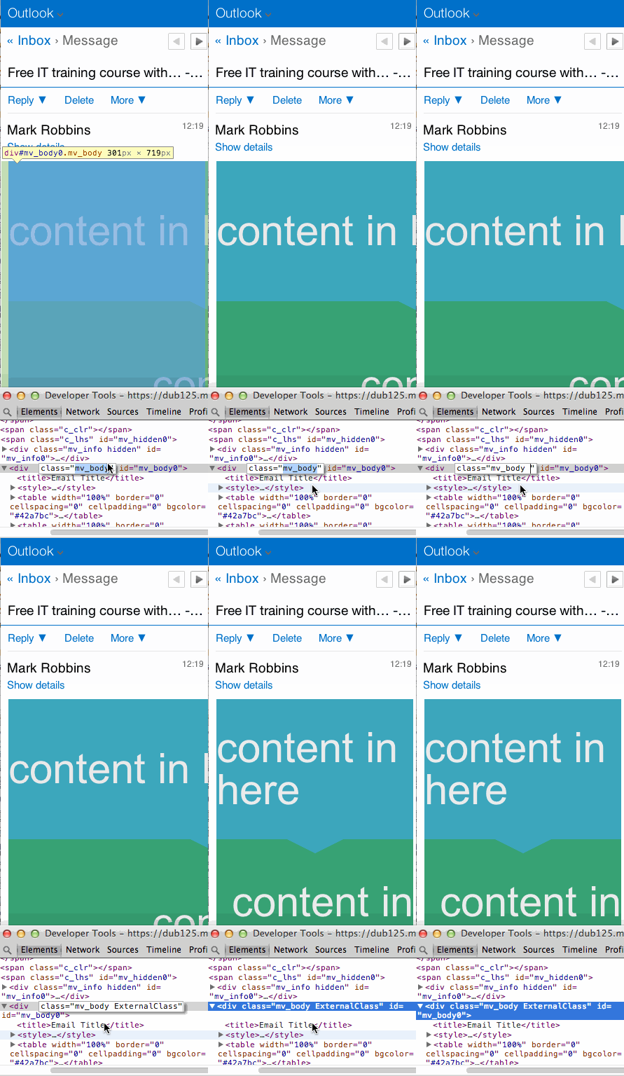
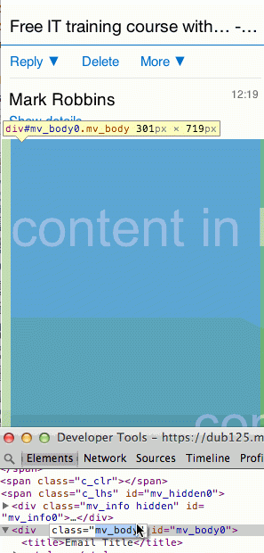
This works great on Outlook.com but on the mobile version of the site they have left out the containing class=”ExternalClass”. Your styles are still edited to .ExternalClass .ecxMyClass but the browser can’t find .ExternalClass so none of it works. Not just your media queries, NONE OF IT WORKS!
Using firebug I added the class back in and, voilà the email is responsive.

To me this looks like a bug, someone has probably coded the m. site and just forgotten to include the ExternalClass. I’ve informed Outlook about this both via their feedback form and through a friend who works for Microsoft. I’ve not heard anything back yet but if/when I do I’ll update this post.
